I noticed a job advert a couple of weeks ago, and listed amongst the required skills was R. A language I used once in a tutorial during my Masters degree, but I have left R to the statisticians.
Since my interest was piqued I took a look at the R-bloggers.com site, and was really blown away by the versatility of R. So here is a description of what I have been playing with for the past 24 hours.
Goal
I worked for the Strathclyde Fire and Rescue for a while, and thoroughly enjoyed that. Something that I always wondered if there was a pattern to was Postcodes. I realise that generally a G11 and a G12 postcode will border each other, but I wondered what I could find out by playing with R briefly.
Need Input
The Ordinance survey recently started making various data sets available for free, including Code-Point Open… postcode co-ordinates. Now these are wonderful, but slightly obfuscated by the co-ordinates being Easting and Northings (epsg:27700); something which most packages would baulk at.
Python
So, the first thing to do, was to make this data set palatable to R was to make this conversion. Mapnik provided the tools for this. There were numerous examples of worked examples online, so I cobbled together a script to process all of Glasgow’s (G) postcodes.
R
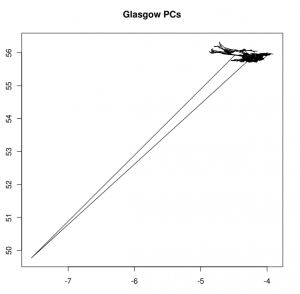
Again, trivial things, but first I needed to load this new data into R, and wanted to plot x and y as a line graph. (columns latitude,longitude, then the postcode, data sorted into incremental order – tab separated, purely because the OS data was too):
postcodes <- read.table(“/g12Postcodes.csv”, header=T, sep=”\t”)
attach(postcodes)
x<-postcodes[,”longitude”]
y<-postcodes[,”latitude”]
plot(x,y)
which was interesting, certainly some outliers – perhaps something to look into in the future.

Even without the outliers, this is pretty abstract data. I focussed on just G12, an area I know well, and work in. Even then there were postcodes which were clearly in G11 territory, so I dropped them too. Perhaps the post office allows some addresses to use postcodes from nearby if it fits a corporate image or if there is some prestige. Perhaps there is some erroneous data.
I looked into how to flesh out the data with map images. And thankfully RGoogleMaps exists for that.
MyMap <- GetMap(center=c(55.8822509615,-4.3006718681), zoom =14, destfile = “MyTile2.png”,maptype=”mobile”);
I calculated the middle point, and played with the settings for the Map, based on examples seen here.

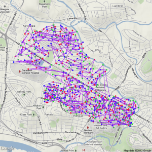
My first attempt, based largely on copied code looked as you see on the right. It really didn’t give much insight. I did learn you could go through a sequence of colours in your plot… and I realised I wanted to try and show direction.
My instinct was to try and add arrows, which, thankfully RGoogleMaps also allowed for, but the result was a little… messy…
But the arrows themselves presented a nice problem. An arrow is a vector, and as such requires direction. And the direction would naturally be the next postcode. But how to reference the next row of a table in code?
The solution I arrived upon was to add the data to the dataset in R. The columns latitude.1 and longitude.1, were set to the next row of data:
postcodes$latitude.1<-postcodes$latitude[c(2:length(postcodes$latitude), 1)]
postcodes$longitude.1<-postcodes$longitude[c(2:length(postcodes$longitude), 1)]

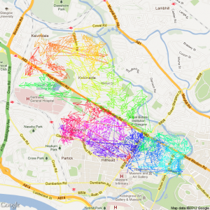
I added a rainbow progression to the code to try and emphasise direction with the following code:
col=c(rainbow(nrow(postcodes)))
The number of steps being the number of datapoints in the dataset.
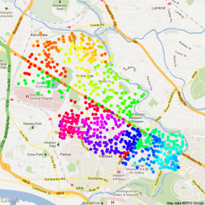
But at least a pattern was emerging… but time was running out, it was getting late, so one last picture to call it an evening. Ditch the arrows, plot the postcode points…
So I ended the evening with this:

It was starting to tell a story, but enough tinkering for one day.
Plans
I really should look into things on an even smaller sample. But I would quite like to get explanations for the outliers. Perhaps with the evenings getting longer I might investigate the Crow Road/Dumbarton road outliers.
Let me know if you spot anything interesting.
Goodnight!

